Start with the job each graphic must do
Signs, labels and printed props are easy to treat as background decoration. Yet every visible word competes for a viewer’s attention. Before designing a notice, package, menu or document, ask what the audience needs from it. Must they read an exact phrase, recognize a type of place, or simply feel that the room is used and inhabited? Those are different assignments, and they call for different amounts of detail.
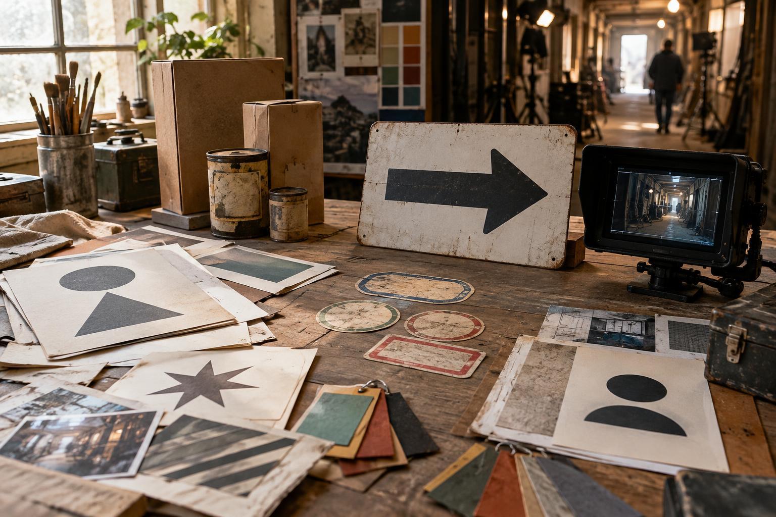
A story-critical graphic should make its essential information easy to find. A label that identifies a misplaced container, for example, needs a clear name or distinguishing mark where the camera can see it. A row of background labels may need only a consistent visual system; writing elaborate copy for each one could add work without improving the scene. Map the graphics to the action and the shots, then give the most time to the pieces that carry meaning.
Design for the camera, not just the printed page
A graphic that looks balanced on a monitor may become unreadable once it is placed across a room, angled away from the lens or partly hidden by an actor. Begin with the likely viewing distance. Keep the key words large enough to register in the intended framing, and test a printed version in the location if possible. A close-up can support fine detail; a wide shot usually needs a stronger shape, fewer words and a clearer contrast between lettering and background.
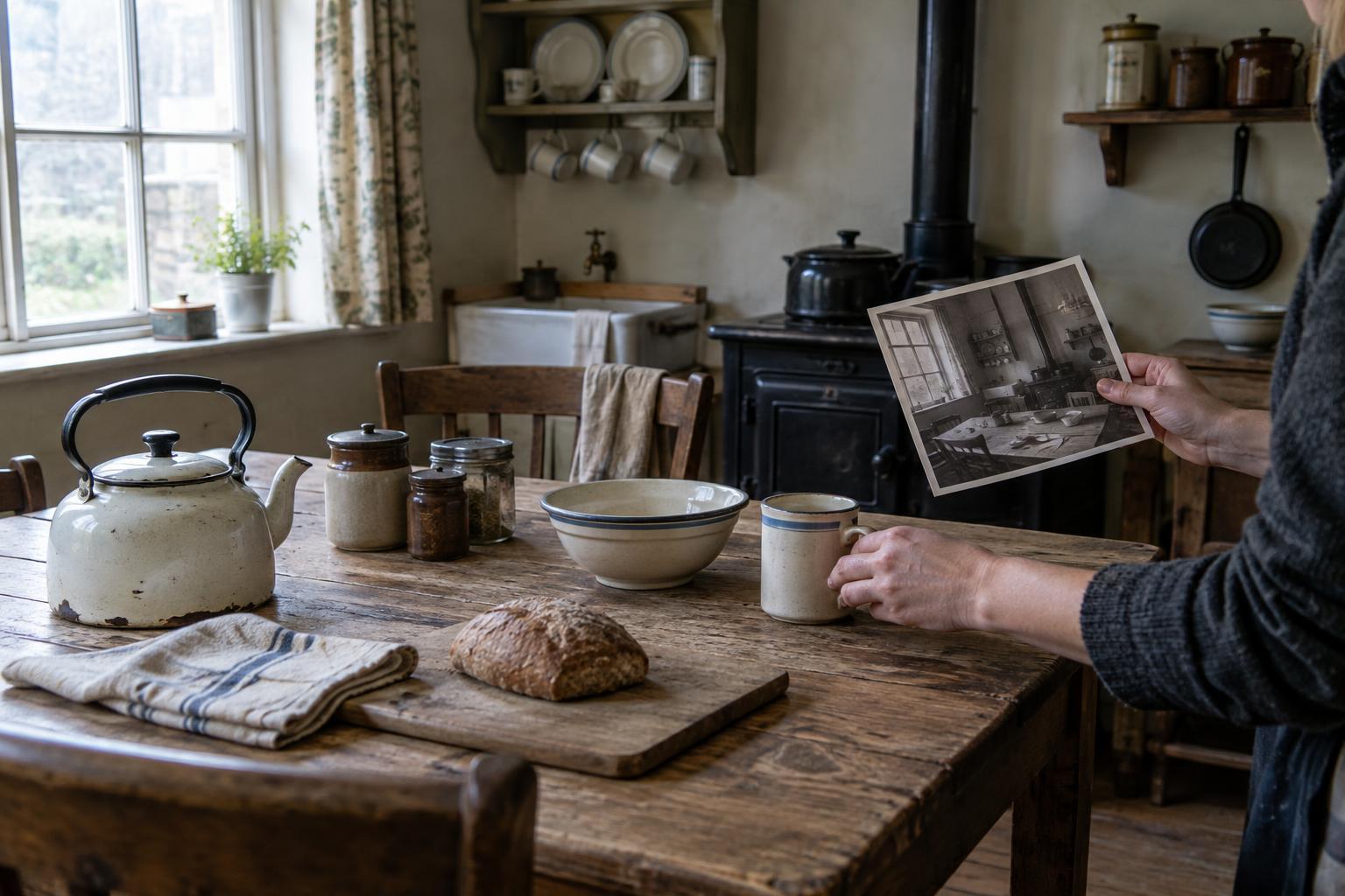
Lighting and movement also change how print appears. Glossy stock may catch a bright reflection, while a textured surface can soften small lettering. An actor’s hand may cover the most important line on a document. If a graphic must be read, coordinate its position with blocking, lighting and camera angle rather than expecting typography alone to solve the problem. Photographing a rough mock-up through the intended lens can reveal problems that are difficult to spot on a flat layout.
Give the world a visual vocabulary
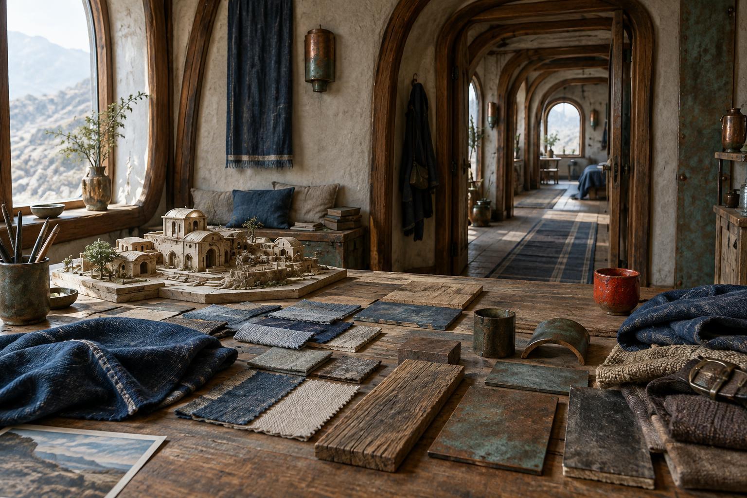
Printed graphics help a fictional place feel coherent when they appear to come from the same people and institutions. Decide who made each item, what tools they had and how carefully they would have worked. A polished visitor sign and a hurried handwritten reminder can belong in the same building, but their differences should make sense. Repeated type choices, colors, materials or layout habits can suggest an organization without requiring a character to explain it.
Consistency does not mean making everything identical. A new policy notice might sit beside an older, faded instruction; a character might add their own note to a standardized form. These layers can show how a space has changed or how people actually use it. The aim is not to hide a message in every prop. It is to make the environment specific enough that viewers accept it, while leaving room for meaningful details to stand out.
Let wear and placement tell part of the story
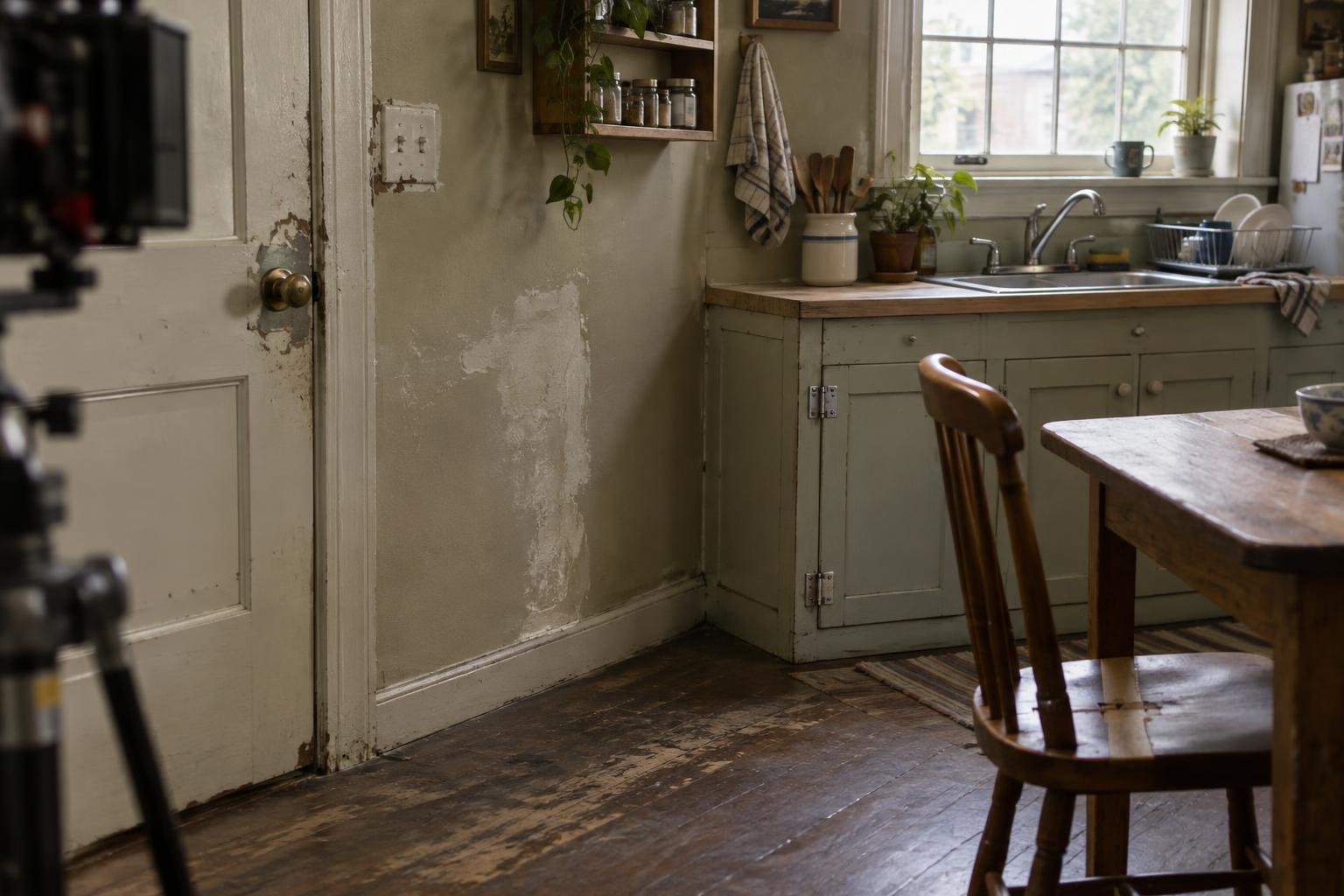
The condition of a graphic matters as much as its design. A pristine warning beside a damaged door suggests a different history from a warning that has been taped over repeatedly. Choose wear according to the object’s use: edges may curl where people handle a notice, while a label protected inside a drawer might remain clean. Random stains and distress can look decorative unless they follow the way the object has been stored, touched or exposed.
Placement creates another layer of meaning. A sign at eye level is meant to be noticed; one buried behind equipment may be technically present but routinely ignored. A neatly aligned label can suggest care or control, while an improvised correction can reveal that a system no longer fits the people using it. These choices work best when they support what the scene already shows, rather than asking a small prop to carry the entire backstory.
Build a workflow that survives production changes
Graphics often change as scenes are revised and shots are planned. Keep a simple record of each item’s purpose, exact wording, size, material and location. Mark which text must be readable and which can remain atmospheric. This helps the art, camera and editing teams understand what cannot be moved or covered, and it makes reprints less guesswork if a prop is damaged.
Make test versions before committing to a large set of finished pieces. Check spelling and story continuity, then view the graphics in context rather than judging them only on a desk. If a page will be handled across multiple takes, prepare matching copies and note how it is folded, marked or worn. Finally, consider what an edit may do: a detail designed for a long close-up might appear only briefly, while a background sign could become prominent in a new framing. Clear priorities make those changes easier to accommodate.