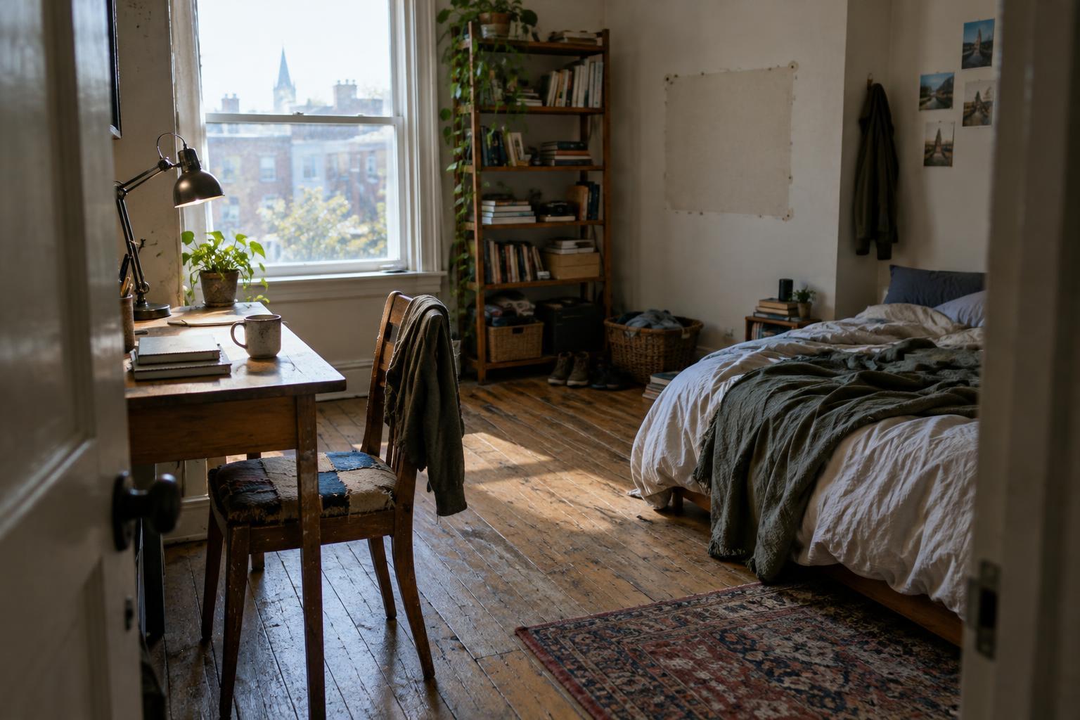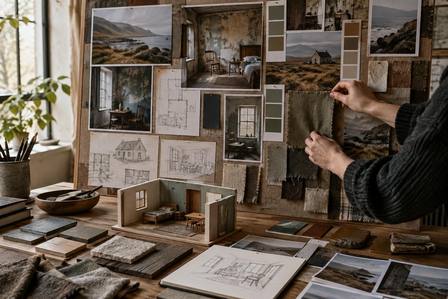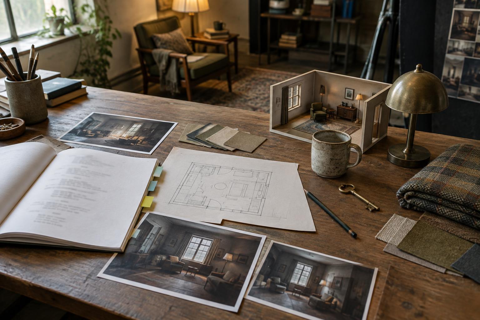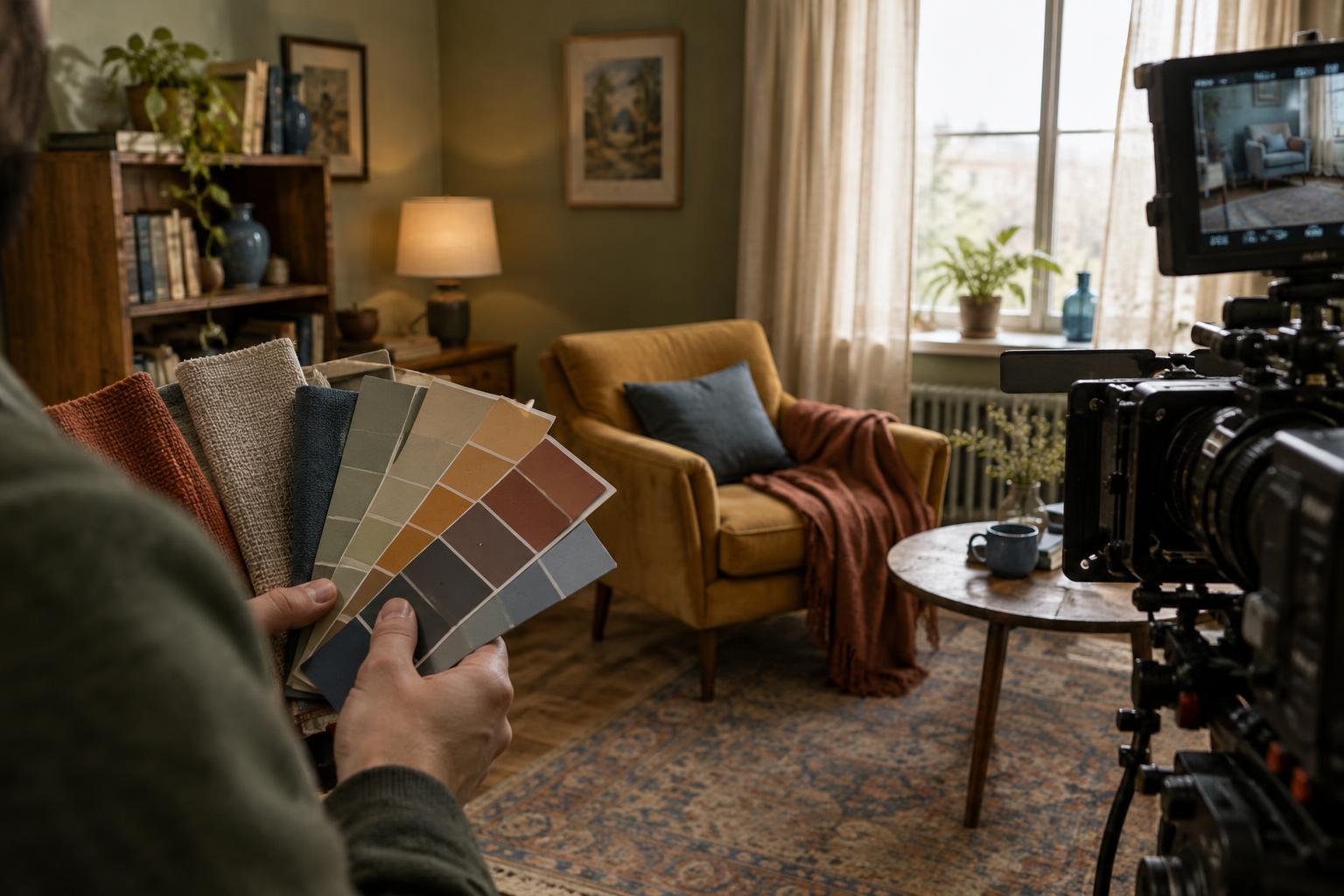
Start with the story, not a collection of attractive colors
A production design palette is a set of color choices that helps the physical world of a film feel intentional. It may guide wall finishes, furniture, signage, props and the colors that appear repeatedly in a location. The goal is not to make every object match. It is to decide which colors belong in the world, where they should appear and what changes the audience might notice.
Before selecting paint swatches, describe the story’s central tension in ordinary words. Is a character trying to preserve a familiar life, escape it or build a new one? Then ask how their surroundings might support or resist that effort. A home that initially feels protective might gradually seem confining without ever changing color: tighter framing, fewer visible exits or a shift in lighting could alter how its familiar walls are perceived. Color works best as one part of that larger visual plan, rather than as a code the viewer must decipher.
Give each space a purpose
Map the major locations by what happens in them. A workplace might demand composure, while a kitchen allows a character to speak freely. Those functions can suggest different color relationships: a restrained range in one space, more varied surfaces in another. Contrast is often more useful than assigning one color to each emotion. If every location is equally saturated, none will feel like a meaningful departure.
Choose a small group of recurring colors and decide which one dominates, which supports it and which appears sparingly. The accent may be most effective when it is reserved for an important prop or a place the character cannot ignore. Think about materials as well as hues. A faded red cushion and a glossy red door may share a color name, but their texture and scale give them different weight in the frame. The choices should make sense for the space’s occupants, resources and history.
Plan for change without forcing symbolism
A palette can develop with a character arc, but that development does not require repainting entire sets. A character may bring a bright object into a subdued room, remove belongings from a crowded shelf or begin spending time in a location previously seen only in passing. These are changes in the designed environment that an audience can register through action. They also give actors something concrete to handle, rather than asking color alone to carry a turning point.
Resist making every appearance of a hue mean the same thing. A blue coat can be practical clothing in one scene and a striking shape against a warm background in another. If a color motif matters, decide when viewers need to notice it and when it can recede. Repetition builds familiarity; variation keeps the world from feeling arranged solely for the camera.
Test the palette in the frame
Colors chosen in isolation may behave differently once they sit beside skin tones, costumes and practical lights. A wall color that looks subtle on a sample can fill much of a wide shot. A small prop may disappear against a busy background. Share location photographs and material samples with the director, cinematographer and costume designer early enough to adjust them. Look at likely camera angles, not just a room from the doorway.
Lighting deserves particular attention. Daylight, a warm table lamp and a colored sign can each shift how a surface reads. If possible, photograph samples in the intended space under lighting that resembles the planned scene. Check both wide frames and close views, including the objects actors will touch. The aim is not perfect color control in every shot; it is to catch choices that distract from a face, obscure an important object or weaken a contrast the scene depends on.
Make a flexible palette the crew can use
Turn the concept into a short, practical reference for each location: dominant colors, permitted accents, key materials and any items whose appearance must remain consistent. Note story changes separately so a room does not accidentally gain or lose an object between scenes filmed out of order. A reference can guide decisions without becoming a rule that forbids every unexpected find.
When resources are limited, prioritize the surfaces and objects the camera will see most clearly. A carefully chosen curtain, table covering or prop can influence a frame more than a costly change to an unseen wall. Leave room for location character, too: existing wear and mismatched belongings can make a space feel lived in. A story-driven palette succeeds when it helps viewers understand the world and its changes, even if they never stop to think about the colors themselves.