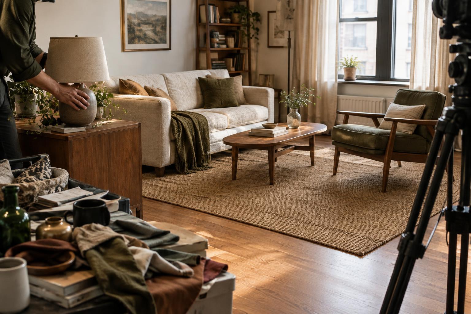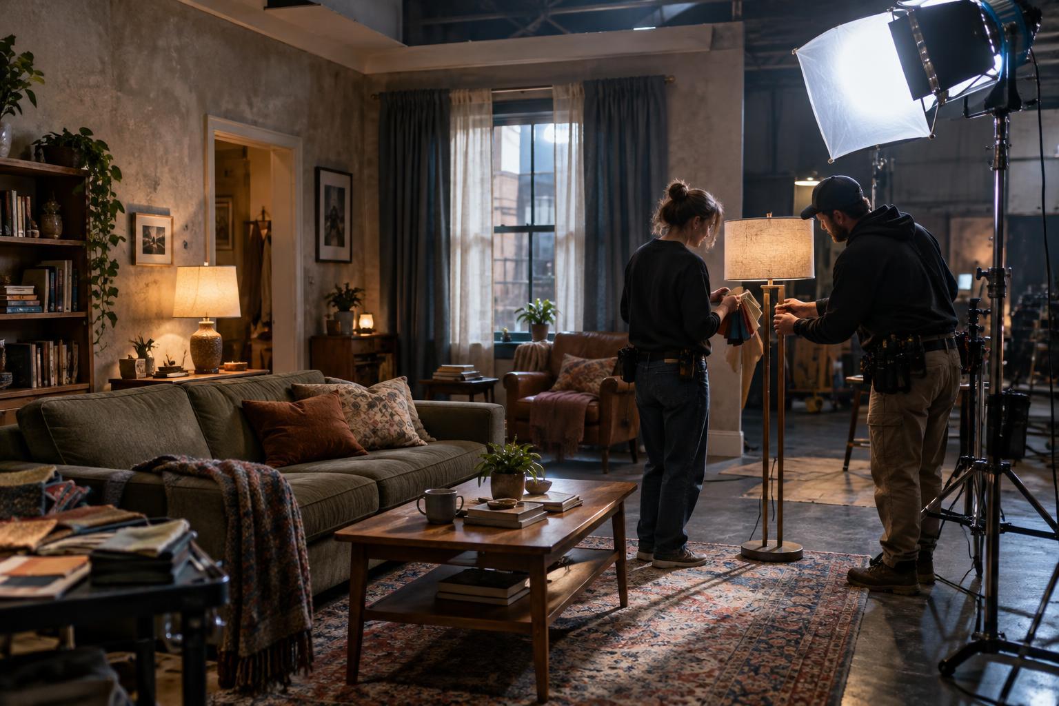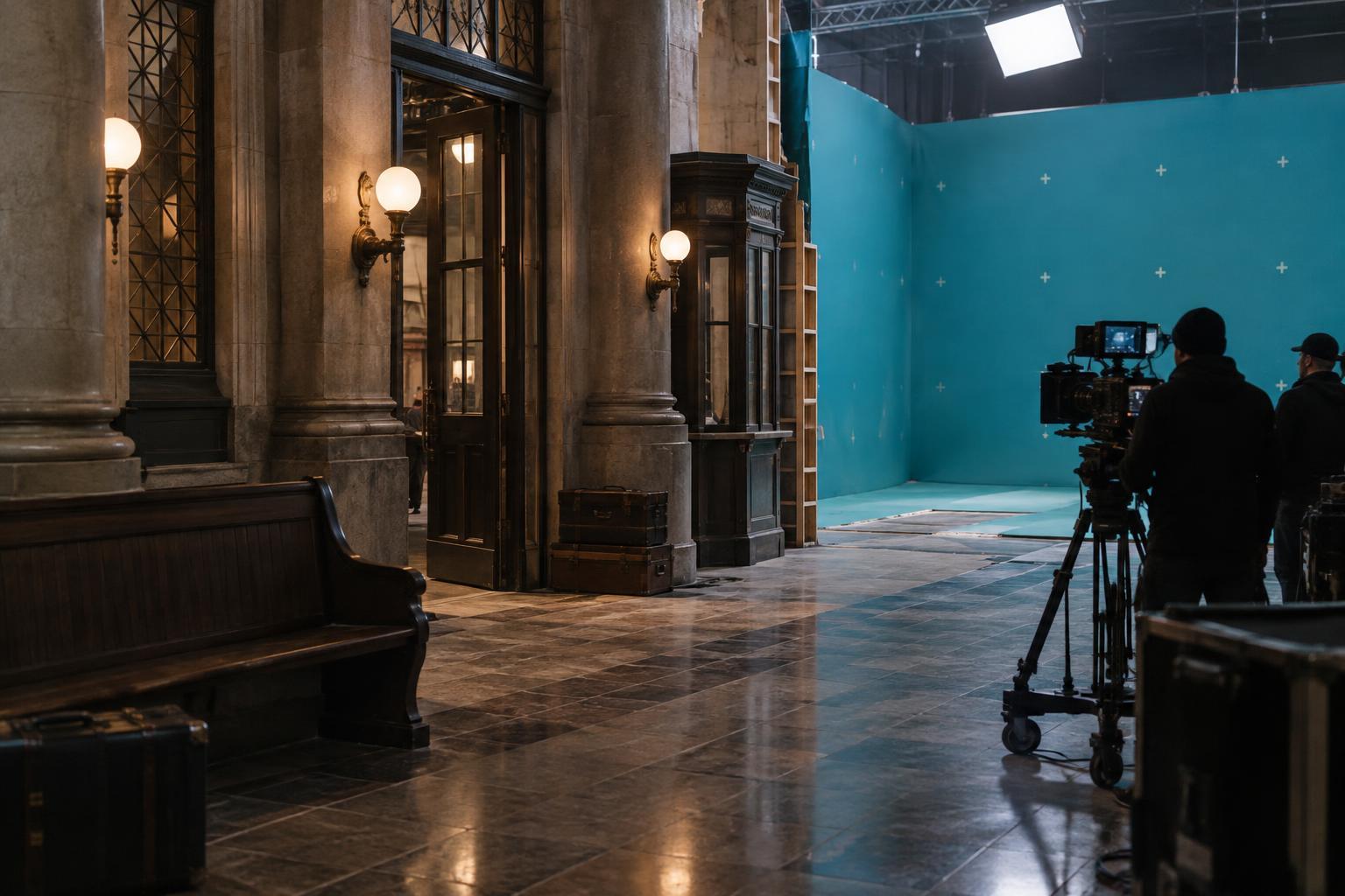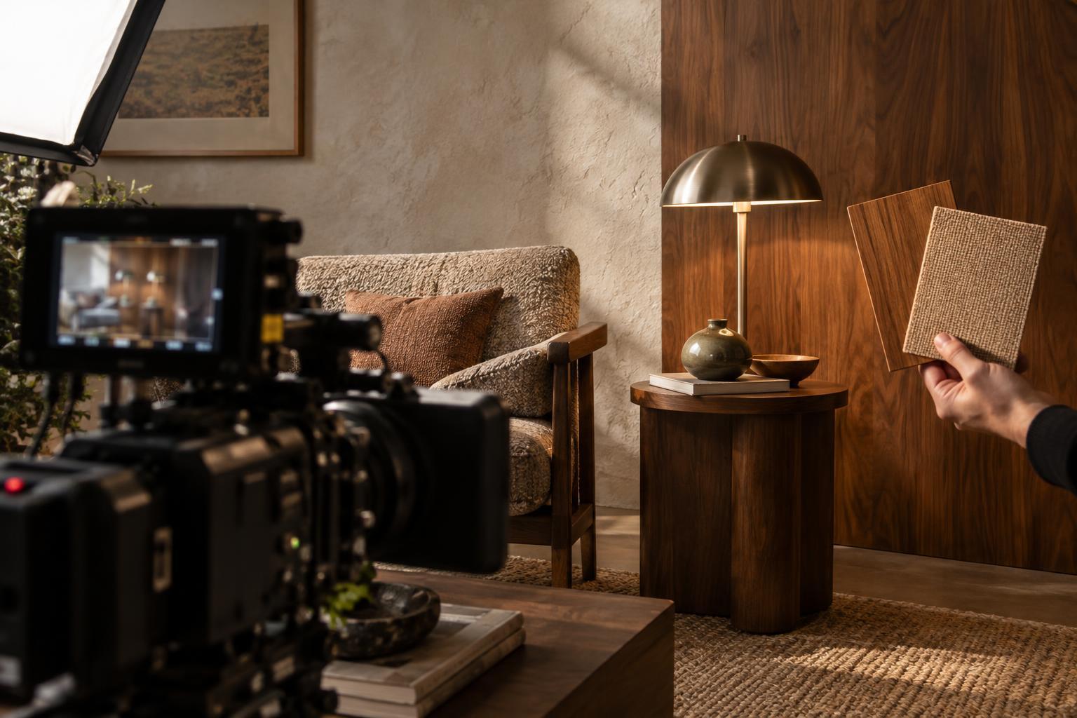
Start with what the material needs to say
Texture gives a setting a history before anyone explains it. A polished tabletop might suggest care, money or an effort to maintain appearances; a chipped edge can complicate that impression. But production design choices only serve the story if viewers can perceive them in the shots where they matter. A surface that feels rich in person may become a flat patch of color on screen, while a small highlight can make a modest prop unexpectedly prominent.
Before choosing a finish, name its job in the scene. Is it meant to establish a place, reveal how someone lives, distinguish two locations or draw attention to an object an actor will touch? That purpose helps determine where detail belongs. A wall behind a fast-moving conversation may need a broad, readable pattern. An object held in close-up can carry finer wear, provided the camera and lighting allow it to be seen.
Match the scale of texture to the shot
Camera distance changes which details survive. From across a room, tiny scratches on a cabinet are unlikely to communicate much; its silhouette, color and larger areas of wear will do more work. In a close-up, those scratches may suddenly become the most noticeable marks in the frame. Designing only for how a material looks at arm’s length can therefore leave a wide shot empty or make a close shot feel busy.
Consider the expected framing while making samples. View a candidate surface from roughly the distances planned for the scene, and pay attention to whether its defining features remain distinct. If a rough wall reads as one uniform tone, larger variations in relief or color may help. If patterned fabric competes with a face, a quieter weave may better support the performance. The aim is not to make every texture obvious; it is to control what the audience notices first and what it discovers on closer inspection.
Think in terms of light, not just surface
A material’s appearance depends on the light that reaches it. Glossy finishes can produce sharp reflections that reveal shape, but they can also catch bright patches and pull attention away from an actor. Matte surfaces generally give more even-looking areas, though subtle detail may disappear under soft, low-contrast lighting. Raised texture often becomes clearer when light falls across it rather than straight onto it, because small ridges and recesses create visible differences.
Test choices under lighting similar to the intended scene. A sample examined in a bright workshop may behave differently in a dim interior or beside a window. Rotate it, move it into shadow and look for unwanted glare or lost detail. Production design and cinematography can solve many problems together: changing a finish, adjusting a light’s angle or placing an object elsewhere in the frame may preserve the intended material without asking the audience to struggle to see it.
Use color and contrast to separate surfaces
Different materials can merge on screen when their colors and brightness are too similar. A dark wooden chair against a dark wall, for example, may lose its outline even if their textures are distinct in person. Separation can come from a lighter edge, a change in sheen, a contrasting object behind it or a slight shift in color. Which solution works depends on whether the chair should stand out or remain part of the background.
Pattern also creates contrast, sometimes more than a scene needs. Dense, repeating marks on wallpaper, clothing or flooring can become visually insistent, especially when several patterned surfaces share a frame. Reserve strong patterns for places with a clear storytelling purpose, and give the eye quieter areas nearby. This creates room for faces, gestures and significant props to register without making the setting feel bare.
Test the material in action
A material should be judged in motion as well as in a still image. An actor may cover part of a set, shift an object into a reflection or cross from one lighting condition to another. Fabric can fold so that its pattern changes character; a glossy floor may reveal movement outside the intended focus. A short camera test with approximate framing, light and blocking can expose these effects before a finish is applied across an entire location.
When reviewing a test, ask simple story questions: What do you notice first? Can you identify the important object? Does the room feel lived in, maintained, neglected or something else? If a texture sends the wrong signal, the answer is not necessarily more detail. Often a restrained change in scale, placement or sheen communicates more clearly. The strongest material choice is one that supports the scene’s meaning while leaving space for the people in it.